12.12.2010

Fairy Tale Christmas


Time for a Christmas illustration for the blog. Last year it was Viking Santa, this year Goldilocks.

This is a perfect example of how deadlines drive illustrators. I came up with this one as a birthday card ("Someone's been eating my cake!"), drew a rough sketch, and then promptly forgot about it. Then along comes Christmas and I realize I have no drawing. So (to quote my three-year-old) ta-da – POOF! It turns into a Christmas drawing, and I get it finished.

12.01.2010

They Draw and Cook - the recipe half


Good news and bad news with this. The good news is that they liked it over at the They Draw and Cook site. The bad news is that it doesn't qualify for their holiday contest. My mistake, really – I thought it was to get a recipe to them in time for the holidays, but what they meant was a recipe for the holidays. So, as much as I'd have liked to have gotten it in to the Food Network contest, even I have to admit that the fish swordsman doesn't really match the theme. Even reworking it with a santa hat instead of a samurai helmet probably isn't going to do the trick.

However, if the Food Network ever celebrates something like Ninja Month, I'm soooo sending it in.

On a side note, big big big thanks to my wife for the recipe!

11.24.2010

They Draw and Cook – the contest


There's a great site called They Draw and Cook, that has recipes as illustrated by a variety of different artists. Anyone is free to submit at any time, but this month has an added bonus – if you submit before November 30th, you're entered into a Food Network blog contest.

I've been meaning to submit something anyway, but art contests motivate me and finally made me come up with something. I was stuck for an idea (my wife is the chef – and an incredible one, I might add – of the family, so recipes didn't come easily to my mind) until I thought of a fish wielding a scallion like a samurai sword. Thus Ginger Scallion Fish was born, ready to take on Ninja chefs.

This is the left half – all their entries may be put in book form, so I decided to make a left and right page (also easier to scan in that way). The right page will have the recipe, along with some more illustration.

11.18.2010

The Lunch Note Project


Here's the beginning of something I've been writing for my daughter. She asked me if I would put notes in her lunch, so I tried to oblige. Now, I'm not the best letter writer, but I do like to tell stories, so the notes ended up as a daily installment.

Instead of putting them here all the time (since they occur daily), I made a separate blog for them called The Lunch Note Project. If anyone's interested in seeing where this goes, that's where they'll all be.

11.12.2010

inspired by "The Magicians," by Lev Grossman


First off, I want to say (for copyright reasons) that all the things in the picture are from Grossman's book "The Magicians." Just so no one comes breathing down my neck about his clock trees.

"The Magicians" is not a kid's novel – it would be, as it's a mix of Narnia- and Harry Potter-type fiction, except that it's also got "Less Than Zero" thrown in there as well. So the main characters are all party-hard, big-city-jaded slackers who happen to go to magic school and (more improbably) want to find a magic land of their childhood. It's a readable book, even if the three elements don't always mesh well together.

The best part for me, though, was the "Fillory and Further" series (his faux Narnia books) that his characters are supposed to have read. They sound really entertaining, which makes me wish he'd actually written those. He even has a fake first chapter of "The World in the Walls" on one of the book's websites.

In addition, there is a fake fan site for the fake books, which includes fake fan art. That's what I really wanted to draw this for – I sent it to them to see if I could have it put up as a fake fan. Alas, as of posting it has gone unregarded.

Since one of his inspirations was Narnia, I chose Pauline Baynes (the original Narnia illustrator) as my inspiration for the drawing. She's got some amazing stuff – I like her work. If nothing else, trying to do this gave me an excuse to look up her work just to check out the style.

11.10.2010

The Mad King


I was getting recycling ready to go out one day, and, as anyone's would, my thoughts wandered to crazy evil wizards. And, of course, if you have mad wizards there's also a mad king around somewhere, so this guy popped into my mind. He started out as a sketch on the border of a sudoku page, and ended up here.

11.08.2010

Kiss the Cook... and you DIE!


I just got a third story published over at Enchanted Conversation - it's a great site for re-imaginings of the classic fairy tales. They're on issue 4 at the moment – if it's a genre you're interested in, I highly recommend it.

My story is "Cooking Children! with Witch Wanda." If you read it, you can tell that there's a LOT of Cooking Channel being watched in our house (and okay, I'll say it, Crone Weekly is inspired by Us magazine. But it's my wife's, not mine, really!). In it I describe Witch Wanda's apron, and decided to draw up some possible versions of it. They're just comps, since I can't make up my mind which one I like better. Anybody have a preference?


11.05.2010

Been off for a while...

... to Hong Kong, Taiwan, and Macau. Great times! Even got some sketching done in art museums, as well as taking lots of pics, that will probably end up as paintings here on the blog.

But, before I went, I did one more drawing for my friend's wedding. It's for the Ketubah, a Jewish wedding contract, that he wanted to liven up a bit with an illustration. It's been printed at the same place as the bicycling rabbi, so that means it was made into a printing plate, old-school style. Love that.

Here's the drawing:


9.01.2010

The Startling Conclusion!


Startling to the greedy woodcutter, that is. Just about everyone else saw this coming.

My next big question – do I give the kids this book now, or hold off on it for a Christmas book? If I give it to them now, it might be a tad more age appropriate. But if I hold off until Christmas, I've got it all finished in September – WooHOO!

I get the feeling I'm going to break down and just give it to them. I've got some months before December, so I've got plenty of time to put something else together.

Wedding Invite


Nope, not the other one - if it were, it would be a bit of a departure from the swans. This is a different one, for a buddy of mine at work (must be my year for wedding invitation drawings).

The best part about this invitation is that it was printed up on letterpress. That means that all the type was set in the old way, with each letter cast in lead and put together Gutenberg style. And what it also means is that the drawing was printed the same way. So they took the drawing, and sent it off to have it made into a metal plate for the press. Not just Illustrator pixels, not a paper printout, but cast in metal.

I feel like Albrecht Dürer.

If he drew bicycling rabbis, that is.

8.30.2010

Tiger Icon


Featured on Creattica

Despite being a lifelong bibliophile, I'm really getting into the idea of the e-book. In particular, the style of art for the accompanying drawings. Here's a foray into the world of icon design.

8.18.2010

The Woodcutter Story: Several Problems Resolved

This isn't a post about new art per se, although some of that comes into it. It's more about composition and consistency.

In the Frog Prince book, one of the things I liked most about doing it were the split-screen pages, like this one:


But, because of the way the story went, I didn't really have an opportunity to use something similar for the Woodcutter story. But this kind of bugged me. All the pages seemed so... flat. Granted, all pages are, but it was especially noticeable in this one because of the style of art and how little action happens on some of the pages.

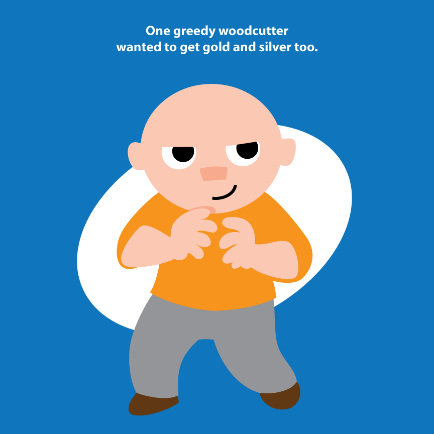
In particular, this page caused the most problems:


It doesn't seem like it would, but it did. Because it's just him standing there. So I got it to where I was happy enough with it, and decided to continue on with other ones. Then, as I was moving along, I got to page 17 (which I'll show in a bit).

On that page, I had to show the bad woodcutter throwing his axe in the water, while at the same time he was pretending to cry. In any other style, I could make this work in a square format. But since the (self-imposed) restraints on the style of this book means I can't use shading, perspective, etc., I was stuck with a composition that was hopelessly horizontal.

The problem was solved, of course, if I could break it up like the Frog Prince story. But I hadn't done anything like that so far, so it would look weird in the context of the book, even if I liked it by itself.

Then I remembered the problem page. If I broke that up, along with its companion page, I'd get this in earlier, and fix the page that was bugging me. Here are the two new versions:


And here's the new one that forced me to overcome the composition problem:


They all look similar here, but in the book they'll be separated by a number of pages, like the split-screen ones in the Frog Prince. The only thing I miss in the silver axe page is that I showed the tree he was standing under in the original version. I liked it, but it couldn't carry the whole page, so out it went.

8.10.2010

Wonder Mom!


Just finished up the dream freelance job! I had to make up a mom superhero for a product launch at a blogging convention. The product was Aquaphor, and they wanted to show moms being, well, the superheroes they have to be all the time.

So I not only got to draw the character, I had to make her sidekick (the rocket-powered product), and a couple comics pages. I especially like The Irritation, but, then again, my wife says I have a knack for super-villains. I like to think that it's because of my writing ability, and not because I want to amass an army of giant spider robots with lasers.

Thanks to Beiersdorf (the parent company) for letting me post these images!

7.27.2010

Big Doings


In size, if nothing else. The kids' Vacation Bible School needed a couple murals for a backdrop, so I volunteered to pitch in. I wasn't the only one – a bunch of the older kids painted a lot of other murals. It's just that they could use an overhead projector to trace theirs, but I had to make these two up to fit a certain space. That being said, they did an amazing amount of work, very quickly.

This is me at home, working on our newly finished floor. I could only do that without fear because of what I'm painting on. It's some kind of weird plastic wrap/paper napkin hybrid that lets no liquid through at all. I have no idea what this stuff is normally used for, or why it's produced in such large sizes, but it works great for impromptu murals.

7.23.2010

Alphabattle!


Check out the alphabattle site – there is a lot of creativity going on there. In particular, the letter H – everyone seemed to pull out the stops on that one. I've been meaning to get into the game, and finally got to pull one together for the letter K, shown here (but also on the K page).

For people interested, you should see the submissions info. You can even put up past letters.

I have an idea in mind for L, which, if executed, will be in a completely different style. Fortunately, I'm not trying to construct a whole alphabet. On the other hand, though, it might be fun to have a whole karate set of letters.

7.15.2010

Meanwhile, Back at the Other Lake...


The one without swans (you'll be seeing more of the swans later, though, the closer I get to finishing it). Still making my way through this – I'd like to finish it soon, so I can move on to an animal story for the kids' annual Christmas book.

7.08.2010

Wedding Invite: the pencil comp


A friend is getting married in Hong Kong this year, and she asked Serena to do the invitation, and me to do the drawing. She said she wanted swans, so my first take on this was to do them like an Asian brush painting.

When she saw them, she said don't do that. Go full-out fairy-tale style.

For me, that's like saying to your puppy, "No, don't play with the rubber bone. Here, have some steak."

I mean, I love Chinese and Japanese brushwork, it's absolutely amazing. But even more than that, I'm the biggest fairy-tale geek, so I was all over this.

The final will be in full color, so I get to have even more fun.


6.07.2010

The Story Continues


Oh, those sneaky mermaids. Good thing our hero is so honest.

5.25.2010

Wherein Woe is Expressed and a Mermaid Enters


Back to the pages. This one is different than The Frog Prince for me. For some reason, it was easy to come up with Moy Moy's expressions on computer. But for Gavin, I need to sketch it out first, scan it in, and trace it on screen. Every page I do this, while for The Frog Prince I think I drew 2 rough sketches for the whole book. I'm not sure why; maybe without a floor-length dress, the main character shows more body language, which I can render best in pencil first.

Below is an example from an upcoming page:


I like the looseness of pencil. But the bright colors and shapes are better for a toddler book, when it comes down to a finish.

The Joy of Computer Art

Ordinarily, I'm much more a fan of traditional art. I like getting in there and really working with the media, in a drawing sense even more than painting.

But sometimes, it's really great to have done something on computer.

The current story being a case in point. When I was in art school, David Macaulay spoke about the process of creating children's books. And what stuck with me the most was that the illustrator shouldn't draw the book from start to finish, because your facility with drawing the characters will improve as you go along. If you go from the beginning on, this change will be obvious to the reader. If you jump around so you've created the illustrations out of order, this isn't nearly as noticeable.

With my hand-drawn work, I've found this to be incredibly good advice.

Now to the computer part. I've definitely noticed that I'm doing this with the Woodcutter in this book. I've gotten into a way of drawing him that I really like. So when I went back to look at page one, I could see that the character was waaaay off. Features too small, head too round.

With traditional illustration, this would mean doing it all over again. On computer, I cut and pasted the head I liked, and now they all look consistent. Took all of five minutes. Glorious.

Here's a side-by-side comparison:

5.24.2010

Out of the woods and back to the woodcutter


A couple more pages, with art advice by Serena again. Thanks to her pointing it out, I saw that I got a bit off style with the original pages 2 and 3. So not only are those are gone, but changing it made the story move along a lot quicker as well. So another round of thanks are due to my lovely wife.

Someday, as my delusions of grandeur assure me, when my fairy tale books are studied by doctoral students, I'll release the first drafts so people can see my working process. But here in reality, I'll just post these.

5.21.2010

Sorry, Were Those Yours?


I was putting too much thought into this one, which made it seem like it would never get finished. So I just decided to do a little bit at a time. That way, I'd just play with it, instead of trying too hard. And then, after a couple weeks or so, when I went to work on it again, it looked finished. It just sort of happened, somehow.

Which seemed so highly improbable that I asked another artist I work with if he thought it looked finished, and he said yes as well.

So here it is. The picture of the little bird that caused Hansel and Gretel so much trouble. I'm going to start a witch picture in the same vein at some point, but I've really gotten going on "The Woodcutter and the Mermaid," so there will be a lot more pages of that up first.

5.07.2010

The Woodcutter and the Mermaid – It Begins!


With the Woodcutter, of course. This is actually my second attempt at this first page. In the first one, I was trying to draw a caricature of my son Gavin, while keeping it in the same style. I made sure I worked it over and over, to get it as carefully crafted as I could.

Then, when I showed it to my wife, she said it had no life to it.

Now, this might sound like she's being critical, but as soon as she said it, I knew she was completely right. So I went back to the drawing board, thought happy instead of clever, and ended up with this sprightly fellow.

To sum up: these things are a lot more fun, thanks to Serena. But then again, everything is a lot more fun for the same reason, so no surprise there.