9.01.2010

The Startling Conclusion!


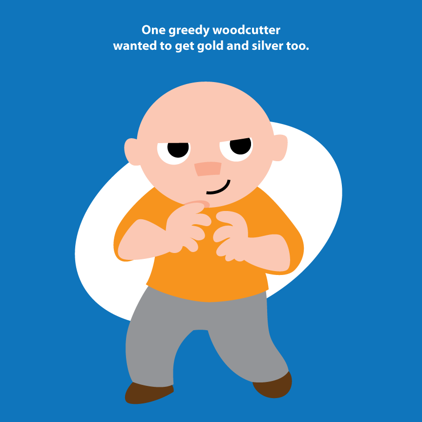
Startling to the greedy woodcutter, that is. Just about everyone else saw this coming.

My next big question – do I give the kids this book now, or hold off on it for a Christmas book? If I give it to them now, it might be a tad more age appropriate. But if I hold off until Christmas, I've got it all finished in September – WooHOO!

I get the feeling I'm going to break down and just give it to them. I've got some months before December, so I've got plenty of time to put something else together.

Wedding Invite


Nope, not the other one - if it were, it would be a bit of a departure from the swans. This is a different one, for a buddy of mine at work (must be my year for wedding invitation drawings).

The best part about this invitation is that it was printed up on letterpress. That means that all the type was set in the old way, with each letter cast in lead and put together Gutenberg style. And what it also means is that the drawing was printed the same way. So they took the drawing, and sent it off to have it made into a metal plate for the press. Not just Illustrator pixels, not a paper printout, but cast in metal.

I feel like Albrecht Dürer.

If he drew bicycling rabbis, that is.

8.30.2010

Tiger Icon


Featured on Creattica

Despite being a lifelong bibliophile, I'm really getting into the idea of the e-book. In particular, the style of art for the accompanying drawings. Here's a foray into the world of icon design.

8.18.2010

The Woodcutter Story: Several Problems Resolved

This isn't a post about new art per se, although some of that comes into it. It's more about composition and consistency.

In the Frog Prince book, one of the things I liked most about doing it were the split-screen pages, like this one:


But, because of the way the story went, I didn't really have an opportunity to use something similar for the Woodcutter story. But this kind of bugged me. All the pages seemed so... flat. Granted, all pages are, but it was especially noticeable in this one because of the style of art and how little action happens on some of the pages.

In particular, this page caused the most problems:


It doesn't seem like it would, but it did. Because it's just him standing there. So I got it to where I was happy enough with it, and decided to continue on with other ones. Then, as I was moving along, I got to page 17 (which I'll show in a bit).

On that page, I had to show the bad woodcutter throwing his axe in the water, while at the same time he was pretending to cry. In any other style, I could make this work in a square format. But since the (self-imposed) restraints on the style of this book means I can't use shading, perspective, etc., I was stuck with a composition that was hopelessly horizontal.

The problem was solved, of course, if I could break it up like the Frog Prince story. But I hadn't done anything like that so far, so it would look weird in the context of the book, even if I liked it by itself.

Then I remembered the problem page. If I broke that up, along with its companion page, I'd get this in earlier, and fix the page that was bugging me. Here are the two new versions:


And here's the new one that forced me to overcome the composition problem:


They all look similar here, but in the book they'll be separated by a number of pages, like the split-screen ones in the Frog Prince. The only thing I miss in the silver axe page is that I showed the tree he was standing under in the original version. I liked it, but it couldn't carry the whole page, so out it went.

8.10.2010

Wonder Mom!


Just finished up the dream freelance job! I had to make up a mom superhero for a product launch at a blogging convention. The product was Aquaphor, and they wanted to show moms being, well, the superheroes they have to be all the time.

So I not only got to draw the character, I had to make her sidekick (the rocket-powered product), and a couple comics pages. I especially like The Irritation, but, then again, my wife says I have a knack for super-villains. I like to think that it's because of my writing ability, and not because I want to amass an army of giant spider robots with lasers.

Thanks to Beiersdorf (the parent company) for letting me post these images!

7.27.2010

Big Doings


In size, if nothing else. The kids' Vacation Bible School needed a couple murals for a backdrop, so I volunteered to pitch in. I wasn't the only one – a bunch of the older kids painted a lot of other murals. It's just that they could use an overhead projector to trace theirs, but I had to make these two up to fit a certain space. That being said, they did an amazing amount of work, very quickly.

This is me at home, working on our newly finished floor. I could only do that without fear because of what I'm painting on. It's some kind of weird plastic wrap/paper napkin hybrid that lets no liquid through at all. I have no idea what this stuff is normally used for, or why it's produced in such large sizes, but it works great for impromptu murals.

7.23.2010

Alphabattle!


Check out the alphabattle site – there is a lot of creativity going on there. In particular, the letter H – everyone seemed to pull out the stops on that one. I've been meaning to get into the game, and finally got to pull one together for the letter K, shown here (but also on the K page).

For people interested, you should see the submissions info. You can even put up past letters.

I have an idea in mind for L, which, if executed, will be in a completely different style. Fortunately, I'm not trying to construct a whole alphabet. On the other hand, though, it might be fun to have a whole karate set of letters.

7.15.2010

Meanwhile, Back at the Other Lake...


The one without swans (you'll be seeing more of the swans later, though, the closer I get to finishing it). Still making my way through this – I'd like to finish it soon, so I can move on to an animal story for the kids' annual Christmas book.